 |
| Home | Azo | Writings | |
TONING AZO
Many printers eventually decide to explore the colorful world of the monochrome image. If you work in B&W, odds are you pretty quickly start experimenting with toning, either for archival permanence or for the color shifts toning can produce on some papers. For example, toning with Selenium is de rigeur these days to provide archival stability for the silver image i.e., increase the permanence of the print. Anyone who has looked at the eggplant hue of a selenium toned print or the warm yellow brown of a sepia toned print is also aware of the creative potential afforded by toning. This paper starts by taking a look at what toning is about, then goes on to look at factors that influence print color and finally talks about the magic of toning Azo.
Toning
Before examining toners, it might be pertinent to differentiate between tone and tint. Tint refers to the color of the base of the paper and is most easily seen in the highlights. Tone refers to the color of the silver grain image (and not the paper base) and this color is most easily seen in the mid-tones and shadows. One classification separates toners into four basic types: replacement, mordant dye, color coupler, and straight dye toners. They vary in their method of working and final result.
Replacement toners chemically replace the silver salts in the print emulsion into a different metallic compound, typically a compound that is more resistant to pollutants than the original silver. This usually alters the print's color as well. Replacement toners include those that increase the archival permanence of a print. Selenium toning is said to yield a blueish-purplish hue on warm tone papers and reddish-purplish hue on cold tone papers. Sepia toners give papers a brownish color (although one would see considerable variation based on the exact sepia toner used). Gold is often used as the most pleasing way to get a blue-black color. Other colors are presumably possible with experimentation with papers and developers and formulae. Toning often also serves to alter print characteristics (e.g., toning in Selenium or gold will often boost density and contrast in the shadows, the bleach process of some sepia toners can result in a slight loss of highlight detail, etc). These are the toners used for archival preservation (but evidence suggests that toning must be carried to completion for archival protection of the silver image).
Mordant dye and color coupler toners are able to produce the most dramatic color changes among all of the toners. These toners usually consist of two solutions. The bleach or activator solution is the "mordant" which alters the silver in the print to receive the dye. After a wash, the print is put into the dye solution, then cleared and washed. Different colors can be combined in one print by toning first in one color then another. Mordant dye and color coupler toners are not archival and the colors may fade with time from light exposure. Examples would be the iron blue toners and the copper toners. Many folks find the dramatic color shifts a little… well, un-subtle.
Straight dye toners are the simplest of the toners. Actually a tinting process, straight toners actually tint the paper base instead of dying the silver of the emulsion. This can decrease the contrast of the image, depending on the color and intensity used, so the image to be tinted usually needs to be printed with more contrast and/or darker than normal. Coffee, tea, food colorings or any other dying or staining solution can be used to tint a photographic print, but there are commercially prepared types as well. Tinting (toning with straight toners) is not archival, and some tints may eventually fade or even change color depending on the amount of exposure to air and light. If you really want to experiment, try various staining methods; e.g., try turmeric for a sunlit tint.
Needless to add, there is typically a preference for the archival quality of replacement toners. These are the toners I use and my work here is done with selenium and sepia toners (I've found gold a little rich for my blood). My work here is thus limited to exploring archival toners, specifically selenium and sepia.
Tone - Where does print color come from?
Print color is principally tied to the size of the silver grain. In early stages of development, the silver grains are small and are actually very colorful. The characteristic peach and pink of lith printing derives from this property. As development proceeds, the silver grain becomes larger and starts joining with other silver grains. Print color tends to drift towards black or blue-black. (MAS: This explains when Azo is developed for more than one minute, the print color gets cooler.) This has been the basis of techniques to produce print color.
In practical terms, various factors impact grain size and print color - paper, developer, exposure, developing technique, toning, bleach and redevelopment, etc. First, a lot depends on the emulsion i.e., the paper and its properties (more on this later). If one wants a warm color, one could overexpose the print a little and use a warm tone developer. The overexposure allows one to pull the print a little early, when the silver grains are still small and colorful. Subsequent toning processes can be used to enhance this color. Similarly, one can tweak developers to push the color towards warm or cool. Benzotriazole cools the image, bromide warms the image, and sodium carbonate cools the image. Glycin and chlorhydroquinone based developers tend to warm the image tone, especially if benzotriazole is omitted.
While getting warm tones has been relatively easy, getting cold tones is more difficult. You can develop to completion (at which point the color has drifted towards black) but there's really nowhere to go beyond developing to completion. So if the emulsion was designed to produce large enough grains that would look blue-black when developed with appropriate developers, it was possible to get a hint of frost but not much beyond. Iron toners provide a pretty brash blue. By and large, if one wanted genuinely cold tones (beyond that obtained from the natural tendency of the emulsion), the most feasible way has been to develop warm tone papers and tone them in gold toners that shift the tone towards blue. Gold toners often work by coating the silver grain—light has to pass through this coating which is supposed to cause the color shift.
Emulsion characteristics
Before proceeding, a disclaimer! I have not seen the following discussed anywhere. Please understand this is pure speculation on my part and I have no way to confirm or disconfirm what I'm saying. I would be very grateful if anyone is privy to information that could confirm or disconfirm what follows.
Papers are often classified based upon their halide content. However, this is at a very broad level i.e., papers are classified as bromide, chloro-bromide etc. Unfortunately, manufacturers rarely spell out the content of the emulsions (e.g., percentages of chloride and bromide etc), which are often trade secrets. A lamentable sidebar to such a situation is that it is left up to the user to experiment with various papers to find one that will work for him. After all, Manufacturer X's chloro-bromide emulsion may be warmer than Manufacturer Y's chloro-bromide emulsion.
Most papers today are chloro-bromide emulsions or bromide emulsions. Most papers that are referred to as cold toned papers (for e.g., the late lamented Brovira) appear to be bromide papers—these essentially provide neutral to a touch of cold tones by direct development with energetic, cold tone developers. Other cold tone papers of today (e.g., Oriental Seagull) do not specify the halide content but consensus seems to be that they are bromo-chloride emulsions i.e., lots of bromide and a little chloride. Most warm tone papers (e.g., Ilford MG warm tone) appear to be chloro-bromide emulsions i.e., lots more chloride.
This was curious. Do bromide papers somehow have a natural tendency towards neutral black or blue black? In which case are the chloride ions somehow essential for the warm tones or colors? I do know there are some differences between silver chloride and silver bromide emulsions. Silver chloride is considerably slower than silver bromide and silver chloride is principally sensitive in the blue and violet regions, while bromide is sensitive further into the visible spectrum. Both silver bromide and silver chloride have essentially the same crystal structure, although there is a difference in the size of the crystal lattice - the silver chloride is smaller. The three halides of silver show a gradual deepening of colour—silver chloride is white, silver bromide is pale yellow and silver iodide is yellow. Why might these colours occur? One speculation I have encountered for this is that the compounds become less ionic on moving from the chloride to the iodide. Thus the charge transfer band would move from the ultraviolet and start to encroach into the blue giving the compound a yellow appearance.
Speculation aside, many printers have stated that silver chloride papers are more colorful than silver bromide papers. From early times, it was known that a wide variety of tones could be obtained with collodio-chloride papers. During his presentation to the London Photographic Society in 1865, Simpson said: The prints I exhibit tonight have been treated in various ways, and many of them have been toned and fixed in the mixed bath of chloride of gold and sulphocyanide of ammonium, which I first recommended for uranium prints. Other in the acetate bath, others in the lime bath, others with sel d'or, and some have been fixed with hyposulfite of soda, and some with sulphocyanide of ammonium. As you will perceive, every variety of tone is possible, from a warm sepia tint to deep black.
I'm no chemist but I wonder if these ions have different potentials for reaction with the developer and whether that accounts for the different responses they appear to give. I would like to reiterate that this is blind speculation on my part. What seems reasonably robust is the fact that silver chloride appears much more flexible than silver bromide, at least when it comes to image tone.
To the best of my knowledge, Kodak Azo is the last of the pure silver-chloride emulsions. It is a contact printing paper that has some wonderful qualities. I was curious about the toning potential of a pure chloride paper.
I can save you a lot of reading. Azo tones superbly. It provides a range of colors that I have never obtained from any other paper, even papers avowedly designed for colorful printing, papers designed for toning, etc.
My first indication that Azo might provide superb control of hues came when I developed it in a Defender cold tone formula (related to Dektol). I was hoping for a cool tone but was completely unprepared for what I saw—a genuinely blue, cold, frosty print. The kind of color I've only seen after gold toning. I'd seen enough warm prints of Azo to know that it could, and did, produce warm tones.
So, I decided to set about exploring the toning potential of Azo. The essence of this consisted of printing a 4x5 negative on Azo and developing it in a variety of developers (both cold and warm one). I then toned these prints in various toners. The details follow.
Materials and Experiment
Exploring the effects of various developers and toning can be somewhat tricky. Different developers do provide somewhat different tonalities on the same papers (those of you who use Dektol and Selectol Soft will recognize this). Thus, different developers would quite literally produce different looking prints. If one were actually trying to make a fine print, one would fine tune exposure and development to get the necessary gradation. I elected not to do so. All prints were exposed identically (under a 75W lamp in a contact printing frame) and developed identically (one and a half minutes at room temperature).
Second, toning processes do not just change the color, they also have an impact on contrast in the print. For example, Selenium is often used to deepen the blacks, the bleach bath in sepia toning often leads to a slight loss of highlight density (common advice is to print about 5-10% heavier if sepia toning is envisaged). Once again, if one were making fine prints, one would make changes to exposure, development etc to get the gradation one wants in the print. I have elected not to do so to ensure that the influence on contrast is also seen. However, keep in mind that some prints will seem heavier and this is not the result of printing exposures etc.
Materials used:
All prints were made on Azo. The developers used were · Ansco 130 (the original formula, not the Ansel Adams variation) at 1:2 · Gaevert G262 (this is a superb warm tone developer which gives different results with different dilutions - I used dilutions 1:1 and 1:6) · Burki and Jenny cold tone developer (a very good cold tone developer that produces a more pronounced cold tone than Dektol)
The toners used for the study were Kodak Rapid Selenium Toner at my standard dilution of 1:24, and the two part sepia toning kit sold by Kodak. The sepia toning kit consists of two baths. The first is a ferricyanide-bromide bleach bath. The second bath is a sulfide toning bath which converts the rehalogenated silver bromide to silver sulfide.
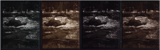
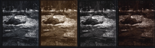
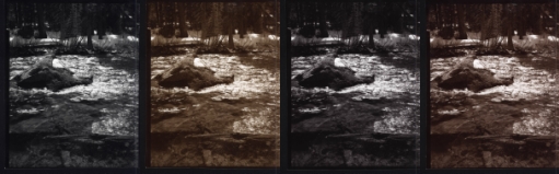
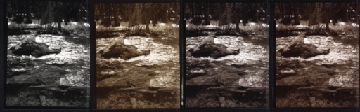
I contact printed a 4x5 negative of the Truckee River onto Azo. All 16 prints received identical printing. I developed 4 prints each in Ansco 130, Gaevert G262 1:1, Gaevert G262 1:6 and Burki and Jenny cold tone developers.
After development and fixing, one print was left untoned. Another one was toned to completion in Selenium. A third one was bleached back to completion in the ferricyanide-bromide bath of the Kodak sepia toning kit and then redeveloped in the sulfide bath of the Kodak sepia toning kit. Finally, the fourth one was bleached back partially in the ferricyanide-bromide bleach bath (specifically, I waited till the texture in the snow on the rock was bleached away), redeveloped in the sulfide toning bath and then toned in Selenium to yield a split toned print.
Thus, there are a total of 16 prints that can be examined (4 developers X 4 toning treatments). However, when I set to the task of writing this article, I pulled out the prints and this brought me to the second problem. I could examine the prints. Communicating these differences has proved more problematic. It would be easy if there was some way to show these prints to everyone. However, I don't know any easy way to do this. I tried scanning the prints but there did not seem to be any way to match the prints identically. The losses were often visible in the shadows that would appear to block up in the JPEG file, even though detail was clearly visible in the print. I could adjust the brightness or contrast values in each file to try and match the prints but not only was it a difficult task, it was also problematic since you would be relying on my sensitivity to differences in prints and my ability to match these. Also, the scans on the monitor at home looked different from the same file viewed on other monitors and I realized that it would be a hopeless task to ensure that all monitors would be calibrated etc. Therefore, I have elected to not make any changes to the scans. These are direct, un-manipulated scans. Take my word for it—there is much, much more detail in the actual prints.
In summary, what I'm going to do is attach un-manipulated scans of the prints to this document. However, I would like to warn you they do not look like the actual prints and so when you read this, please read my descriptions of each print and compare differences between the colors of the prints. Needless to state, you are best served by running your own tests.
Results
Azo is a very colorful paper. There are wonderful interactions between developers and toning processes that provide an incredibly subtle palette. I will first talk about the effects of the developers, then the effects of toners and finally the interactions between developers and toners.
Effect of developers: Look at the untoned versions of the prints developed in the four developers. There are minute differences in gradation and the Ansco print is a little heavy for my tastes (this is mostly felt in the Stygian shadows and the difference is seen quite easily in the highlights on the water and the snow on the rock in comparison to the un-toned print from other developers). The color differences are fairly obvious, even at this stage. I haven't seen such obvious color differences with most enlarging papers. Typically, it is the toning that results in substantial color differences with enlarging papers. Again, I'm curious about these differences.
The warmest print is, as would be expected, the print developed in G262 diluted at 1:6. At 1:1 there is a hint of warmth but the tone is closer to neutral. The Ansco 130 print seems to fall in between; there is a hint of greater warmth than the G262 1:1 print (although I would be cautious about interpreting this since the Ansco print is also a little heavier). The B&J print is nice and cold, a very blue tone in the midtones—you don't even need a comparison print to see the cold tones one can get with this developer and Azo. Needless to add, I have not seen any other paper come anywhere close to such a cold tone—even the Oriental Seagull I use for enlarging, which is reputedly very cold toned, doesn’t come close to the frost with Azo.
Effect of toning: As expected, sepia toning moved the hue towards the yellow/yellow-brown part of the spectrum. It also characteristically reduced density in the prints. Oddly enough, my experience with sepia has always been a very minor loss of detail in the highlights and an opening of the shadows. So, my experience prevents me from agreeing with the typical notion of sepia toning increasing contrast, although I probably would agree with the advice that one should print slightly heavier.
Selenium produced a series of subtle color shifts and its interaction with developer type was most obvious. It did not provide the split tone that people obtained earlier with Azo. Split toning is a term I've seen used to describe a number of related but different phenomena. It basically describes a phenomenon where some of the tones are toned while the others are not. This can be done consciously (e.g., partial bleaching and sepia redevelopment) or it might be a property of the paper/toner combination. For example., selenium apparently used to split tone Azo i.e., it would start work in the shadows and work its way up the scale (and it was either pulled early or never reached the highlight densities). (MAS: Split-toning could be done with older Azo. Some parts of the print tended toward purple; others tended toward blue. Olivia Parker's photographs from the 1970s are perhaps the best example of this split toning.) Selenium toning, as expected, shifted the hue towards the purplish end of the spectrum.
Split toning produced an interesting series of prints with a more burnt siena cast, as opposed to the more raw umber cast of a sepia toned print.
Interaction of developer and toning treatments: As can be seen from the pictures, choice of developer and toner can be used to produce very subtle changes in hue and contrast. As expected, the variations between various paper types are very subtle with sepia toning—this would be expected since the rehalogenating bleach would have converted all the remaining halide in the fixed and washed print.
Selenium produces strikingly different colors depending on which developer was used. The Ansco print (already heavy) suffers in gradation from the fact that the shadows deepen even further in Selenium. The hue seems to have drifted towards chocolate. The B&J print drifts closer to neutral. The Selenium print in G262 at 1:1 shifts towards the purple end of the spectrum. The print in G262 at 1:6 shows a dramatic shift towards a very warm brown.
Split toning with partial toning in sepia followed by selenium toning provided an interesting series of prints of burnt sie
Finally, I have to mention that I have never been able to achieve such a wide variation in print color from one paper. The enlarging papers I have used are a lot less flexible and appear to have a lot more characteristics built into the emulsion. This difference between Azo and enlarging papers were visible at every level. Enlarging papers never differed terribly in treatment with different developers - it was only after toning that one could see the differences in colors produced by different developers. In contrast, the un-toned prints of Azo in different developers provided clear differences in image tone.
What about Amidol?
Amidol has been a mythic developing agent. I’d never experimented with it. One, Richard Henry reported some experiments he did which demonstrated that Amidol did not give a deeper black than other developing agents (although why one would expect that, I can’t fathom). More problematic, Amidol was supposedly ruinously expensive. And to make matters worse, it apparently didn’t keep well.
Then, I read Michael A. Smith’s writings about how easy it was to print with Amidol. So I decided to give it a try.
Like I said, Amidol is the stuff of myth and legend. It is the developing agent with the greatest reduction potential. It is the only agent that can work in an acid solution (i.e., it does not need alkali to activate it). It also is reputed to do the strange trick of developing from the base up (unlike most developing agents, which will work on the surface of the emulsion initially and work their way deeper with time, Amidol is reputed to start developing at the base of the emulsion and work its way up). Michael Smith has said that developing Azo in Amidol for a long time leads to the image seeming to rest on the surface of the paper, while shorter development times gives the impression of the image being deeper in the emulsion, which would seem consistent with the base-up characteristic of Amidol. Amidol has also been a popular developing agent for cold tone formulations (presumably because its high reduction potential makes for an active development, which is key to achieving neutral and cold tones).
So I bit the bullet and ordered some Amidol. I mixed up the formula suggested by Michael Smith. The formula uses Citric acid and sulfite with a trace amount of bromide. The formula thus tends to rein in the power of Amidol—Amidol in a strongly alkaline solution is presumably a pretty active combination. In this formulation, the slow and powerful working leads to a somewhat warm toned developer. If you are partial to cold tones, try Fein’s formula or Looten’s formula or try replacing the bromide with benzotriazole (if memory serves me right, that is Peckham’s variation), etc.
Conclusions
Azo in Amidol is the closest thing to magic I have seen. Prints emerge with the greatest of ease. In this formulation, Amidol lasts for a long time. I have worked more than 24 hours (leaving the developer overnight and continuing to work the next day). There was no “bombing out.” The developer continued to function normally. On one occasion, I must have put about 80 prints through the liter of developer and it was still going at the end of the session.
As mentioned, in this formula, Amidol produces warm tones. Tinkering with the chemistry to get cold tones should be easy (given that Amidol got its reputation as a cold tone agent).
Finally, I should point out that the incomparable scale of Azo seems to work particularly well with Amidol and a water bath. It reduces dodging and burning and produces prints with clean whites and incomparable gradation. Good prints can presumably be coaxed out of any brew and (in my subjective opinion) Azo seems to be easier to print with any brew as compared to enlarging papers, but the Amidol-Azo combination just seems ridiculously easy to work with.
A Summary
Azo is a remarkably colorful paper. I surmise that this is due to the fact that it is a pure silver chloride paper. It works with a variety of developers and toners to produce a rich range of colors.
It should be noted that this might make for a potential minefield. I find that it takes an extraordinary amount of sensitivity to be a good judge of what image tones are appropriate with an image. I have printed with cold tones and gone to ridiculously warm tones in unthinking rebounds. Also, at some point, it perhaps becomes parody—inventions after the fact. After all, if one worked carefully and with fidelity to one’s own experience, one should have a good idea about the final result when tripping the shutter. I have often made a print that was the most closely related to my experience when tripping the shutter and then continued thoughtlessly trying other variations, only to eventually come back to the original that was close to my intentions when I tripped the shutter. I guess learning to listen, recognize and understand oneself takes lifetimes.
Philosophizing aside, if you work in large format, Azo obviates the need to stock 10 different papers. Azo has superb gradation and is a remarkably easy paper to work with. And it provides a range of image tones to suit a range of tastes. If you work in LF, you owe it to yourself to try this paper with a few of your favorite brews.
Table: The rows are developer - row1 is Ansco 130, row2 is Burki and Jenny cold tone developer, row3 is G262 at 1:1 and row4 is G262 at 1:6 The columns are toning treatments - column 1 is untoned, column2 is completely sepia toned, column3 is completely selenium toned and column4 is partially sepia toned and then selenium toned
|
|